Thinking Big and Banging It Out – Poster Design for Michael Pollan at The Crocodile
TONIGHT – Thursday, May 16th at the Crocodile, we have a super-tasty show covering a few of the acclaimed Michael Pollan’s best known books. You should go to it. And now…
If you’ve been to any Bushwick Book Club Seattle event in the last 3 years, what you probably haven’t heard us ask you as much as we should is: how did you hear about the show? Maybe you heard Geoff on the radio. Maybe you know one of the songwriters, musicians, or performers. Maybe you got a Facebook invite from a trusted friend. Maybe you wrote the book.
From now on, whatever the motivations for gathering your book loving butts up from your comfy armchairs actually are, when anyone asks why – you say, “Because of that F’ing Rad Poster.” That will make me feel awesome. Or it will make Michael Wallenfels feel awesome. It’s not important who gets to feel awesome as long as it’s one of us. The performers get to feel awesome all the time either by leaving the stage to a raucous applause, or by leaving the stage without having died of anxiety, or by getting all the chicks, etc. – c’mon, they will be fine.
I know that sounds like a designer saying, “Waaah! We don’t get anything!” Yes, but that would also be what we call “roping you in to a blog post.”
So actually, to be honest, we designers get all kinds of respect and recognition, and a ridiculous amount of praise, especially when like-minded artistic types are involved. But I had to find a way to start writing about the idea of a gig poster as something integral to a successful show. Really, it is very important, but its importance is intrinsic – it’s built in. You can’t not have a poster, or at least it’s not wise not to. Years of experience has taught me the only thing truly impactful about gig posters is whether or not you have one (and also if you distribute any).
Obviously that is simplifying things a bit – there is a wonderfully intricate landscape of gig poster history, from uncommonly awful to absolute works of art. But, The Bushwick book Club Seattle shows are a special kind of opportunity for everyone involved – the grand ambitions vs. reality tug-of-war of putting together something so quickly is not much different than the process all Bushwick performers know so well – a pressure cooker of great ideas and limited time.
Each event brings its own unique experiences for both performers and volunteers and audiences, so today we’re kicking off a regular segment meant to share a little more of that with you. In my case it’s the agony and ecstasy of show poster design, Bushwick style.
Follow along after the break with the (somewhat) less verbose story of the Michael Pollan poster.
So first off – before I forget to ask – did you know you can take home your very own poster for each and every Bushwick event? Yep, you can – and for the rock bottom price of no money. Free posters are available at the merch table at almost every show, and as previously stated, most of them are rad.
I think it’s important to mention that my approach to any poster, and especially any Bushwick poster, is probably different than your typical designer. One thing that’s common among everything Bushwick is the variety the opportunity offers from show to show. You’ll see it in the performances – soulful ballads, tongue-in-cheek, biting critiques, folksy musings, and rappy rap raps – always a surprising potpourri. Each book offers its own unique inspiration. You’ll see some absolutely terrific artwork from Michael Wallenfels for some Bushwick shows, Bushwick showcases, all the programs, and in our bourgeoning brand. We might also get help from other designers and artists with their own signature style. But I thought early on that some shows should reflect the subject matter a little more overtly and I jumped on it – that’s totally my wheelhouse. I don’t know if I could even develop a signature style. My day job (creating graphic design templates) exposes me to a wide array of designers, audiences, and creative intents. I’m naturally open to all kinds of concepts. My basic concept for many book club posters is that they should just scream this famous/classic book/author, now with awesome!
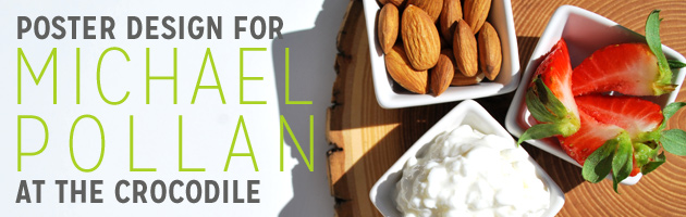
So Micahael Pollan. Hmmm. I usually start that way, just researching and talking to other designers and thinking out loud to my wife and then letting ideas marinate. His books have a pretty specific subject matter, and some really iconic covers you can associate with his work right away. See the cover of his newest book “Cooked” – do you realize you are under boiling water?
Clean photography, wholesome food, thin type… ok. So I had that idea in my head pretty clear, and then, oh then, grander ideas started to take shape. I know a great chef, Chris Rawles. I know a great photographer, Lisa Schattenkirk. She is super exited and has already helped me with other book club posters. This is the way I love things taking shape – I have the resources! I have contacts! I may have too many cooks in the kitchen…
First, just scheduling time for 3 busy people to get together is tough – but we brainstormed. We were creative! Ambitious! Maybe we could plate a gorgeous meal and write out Michael Pollan’s name with some slick typography in a super saturated sauce! We could use some old product photography tricks and mix it with glue so it wouldn’t melt all over the plate. Maybe we could cut letters out of colorful raw vegetables and arrange them within the scene of a fresh meal being prepared at home!
Honestly, most of the ideas we had were great, and we were game for trying all of them and seeing which worked out the best. But then, reality – and the creative spark that is best honed by a deadline set in. We probably would have tried all the concepts we could have. But that would have been a disaster of failed attempts and frustration. Instead, we sobered up to meeting one afternoon planning and the next day shopping, cooking, shooting, and eating.
It was great – it was the best way for everything to come together. Nothing was ideal (except for Chris’s culinary skills), but we were getting it done and doing it well.
Shopping – we needed colors! But wait, didn’t we want a balanced and sustainable meal – wholesome and seasonal and local? Good looking food but also good food. All the intricacies of the books’ subjects started to take hold, but luckily a fantastic selection of organic, free range, grass fed, and heirloom whatnots were readily available in this town.
Cooking and shooting happened simultaneously as Chris went to town in the kitchen and Lisa started experimenting with her camera.
 I played the assistant trying to get some balanced lighting going with the unexpected sunshine. I can’t say enough about Chris’s ability to make just about anything look totally amazing – and fast. We almost used just a single orange beet because it was the first thing he cut and we thought, “that’s gorgeous!”
A steady stream of food was prepped and placed and experimented with. We took hundreds of photos just to be sure that any particular concept that might work as the whole poster came together at least had a pretty good representation. We promised ourselves a somewhat realistic window of time to tackle it all, which went by fast, but buckling down we realized most of what we set out to.

Then it was time to clean up – mostly using our mouths. Chris added some subtle expert touches and we all chowed down. For a few big fans of real food – this was serious gratification.
We said our goodbyes and after a few days of culling and retouching, Lisa sent me the best images we had to work with. Over 3 beers I summarily dived in to putting it all on digital paper. People sometimes ask me how long I worked on one project or another – like actually sitting down in some design application and working until it’s done. So there’s a yardstick for you, I generally measure them in beers consumed. “That there? Oh, I reckon that was about a 3 beer poster.”
I’ll go into detail on some of the other parts of my design workflow in other posts, but essentially all that is left after that is to ask my wife for her final opinion (because I crave approval), and proofreading and maybe add a logo or change a color here or there over the next day and we’re done. Print it. Hang it up.
Then maybe you see it, and maybe you go to a show – a show like tonight’s. And when I see you there, and ask you how you heard about it, now you know what to say.